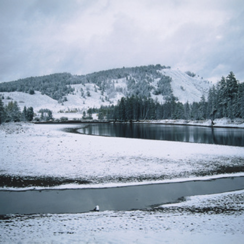
There is a pretty simple trick to enable CSS image filters for background images without changing the markup for the original code. This is an example built from ideas from others, but doesn't move the background image to another element in the markup. It's a pretty convenient way to add filters to background images.
So let's say you have this code:
Now lets say you want the background in greyscale for instance. Now most CSS filters aren't available to target the background layer only, so when you add the filter, this happens:
Now there are hacks to introduce filters to the background by creating extra elements and moving the background image to that one. The drawback to this is that it is usually done with fixed sized items. And if you're in a scenario where you don't have total control over the code produced and want to solve this in CSS alone, there is a pretty simple trick:
What we did was change the parent element to position: relative and then add a ::before element to that one, that is positioned absolutely and inherits the background image, and is then manipulated with the filter. Using z-index we can assure that it is positioned between the actual background element and the content
Blurring
Due to the added element, blurring the background image this way is slightly different than blurring the original element, the blur towards the edges fade out in a way that may not be desirable:
This can be remedied by positioning the new element "outside" the original, like this:
We've also added overflow: hidden to the original element. Something to keep in mind is that the new background image is slightly larger than the original one in this instance.


